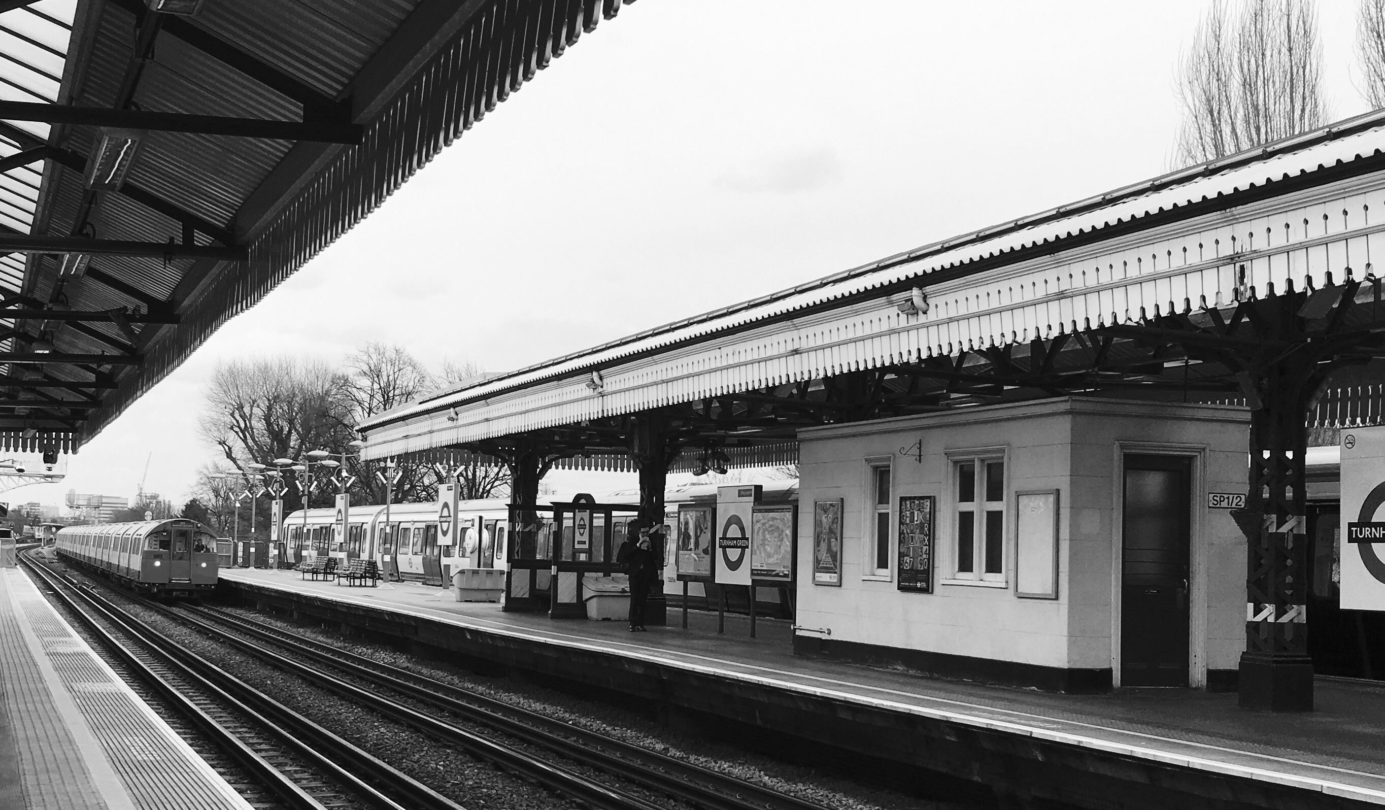
The Hammersmith & City line is the failed rock star of the London Underground. In 1990 it had a mid-life identity crisis and went solo from the rest of the Metropolitan Line. A line which up until this point had conquered every corner of London.
For a while things looked good. The H&C even managed some minor hits stations, such as Royal Oak and Latimer Road, on its very own album section of track between Edgware Road and Hammersmith. It had its own stations and its own names, it was finally an artist a line in its own right.
But things weren’t as they seemed. From the offset the H&C released an unpopular duet with the District Line, who even then didn’t allow it full credit of the Upminster branch. To make ends meet, the H&C had to continue making appearances with the rest of the band Metropolitan Line. Sometimes out of sheer stubbornness the Met would terminate at Baker Street, leaving the H&C to pick up the slack at the big city gigs stations.
The H&C couldn’t cope. It was rock bottom. Things were so bad that in 2009, it reached out to the Circle, gave up 50% of the rights to its only 6 songs stations, and sold out. Last I heard they’d released a new single opened a new station together next to a shopping centre, but even that doesn’t have a ticket office…
The Hammersmith & City Line has just one thing left. The Eastern corner of Aldgate Junction connecting Liverpool Street to Aldgate East. And sometimes… just to prove a point… The H&C will clog it up. Bringing the Metropolitan, Circle and District to their knees.
I guess it got the last laugh after all.
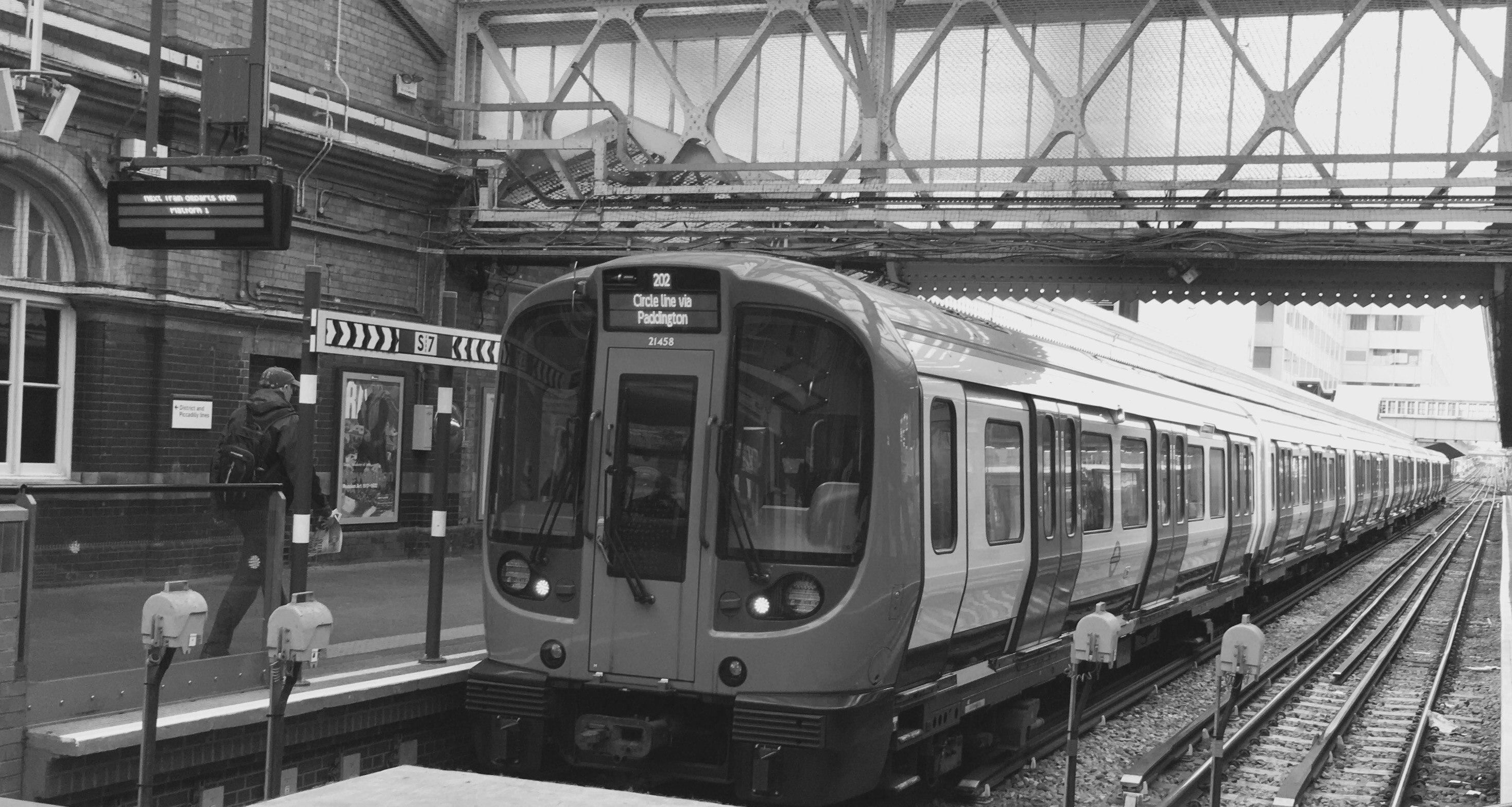
Image copyright A Carter – CallingAllStations.co.uk