Around this time each year the Office of Rail & Road Station Usage Report gets published, which is like an early Christmas present arriving at the doors of CAS Towers. The report details the estimated1 usage of every station8 on the UK rail network.
1Estimated because not all stations on the UK network are gated and therefore do not provide a 100% accurate reading of passenger usage. Usage is also estimated where stations are grouped together as a single destination (e.g. Manchester All, Liverpool All, London Zone 2). For more information click here.
It should also be noted that by utilising the Oyster Card system, the methodology for collecting data in London has greatly changed from last year. (More on this later).
Much raw data, facts, figures, numbers and spreadsheets have been digested, so let’s get straight to business! Like last year, we’ll start by looking at the UK’s most and least used stations. For all the stats I’m using in this review I’m going to be focusing on Combined Entry & Exit data. ‘1 Passenger’ is defined as a journey starting or ending at any given station.
Most Used
| Station | Region | Passengers | |
|---|---|---|---|
| 1 (=0) | London Waterloo | London | 99,148,388 |
| 2 (=0) | London Victoria | London | 81,151,418 |
| 3 (=0) | London Liverpool Street | London | 66,556,690 |
| 4 (=0) | London Bridge | London | 53,850,938 |
| 5 (+2) | London Euston | London | 41,677,870 |
| 6 (+4) | Stratford | London | 41,113,260 |
| 7 (+1) | Birmingham New Street | West Midlands | 39,077,018 |
| 8 (-1) | London Paddington | London | 36,536,074 |
| 9 (=0) | London King’s Cross | London | 33,361,696 |
| 10 (+4) | Clapham Junction | London | 32,282,220 |
Once again, it is of no great surprise that 9 out of 10 of the busiest stations in the UK are in London.
London Waterloo is still runaway winner despite losing a few passengers on last year. In fact of the top 5 only Liverpool Street has actually gained passengers (up from 63m).
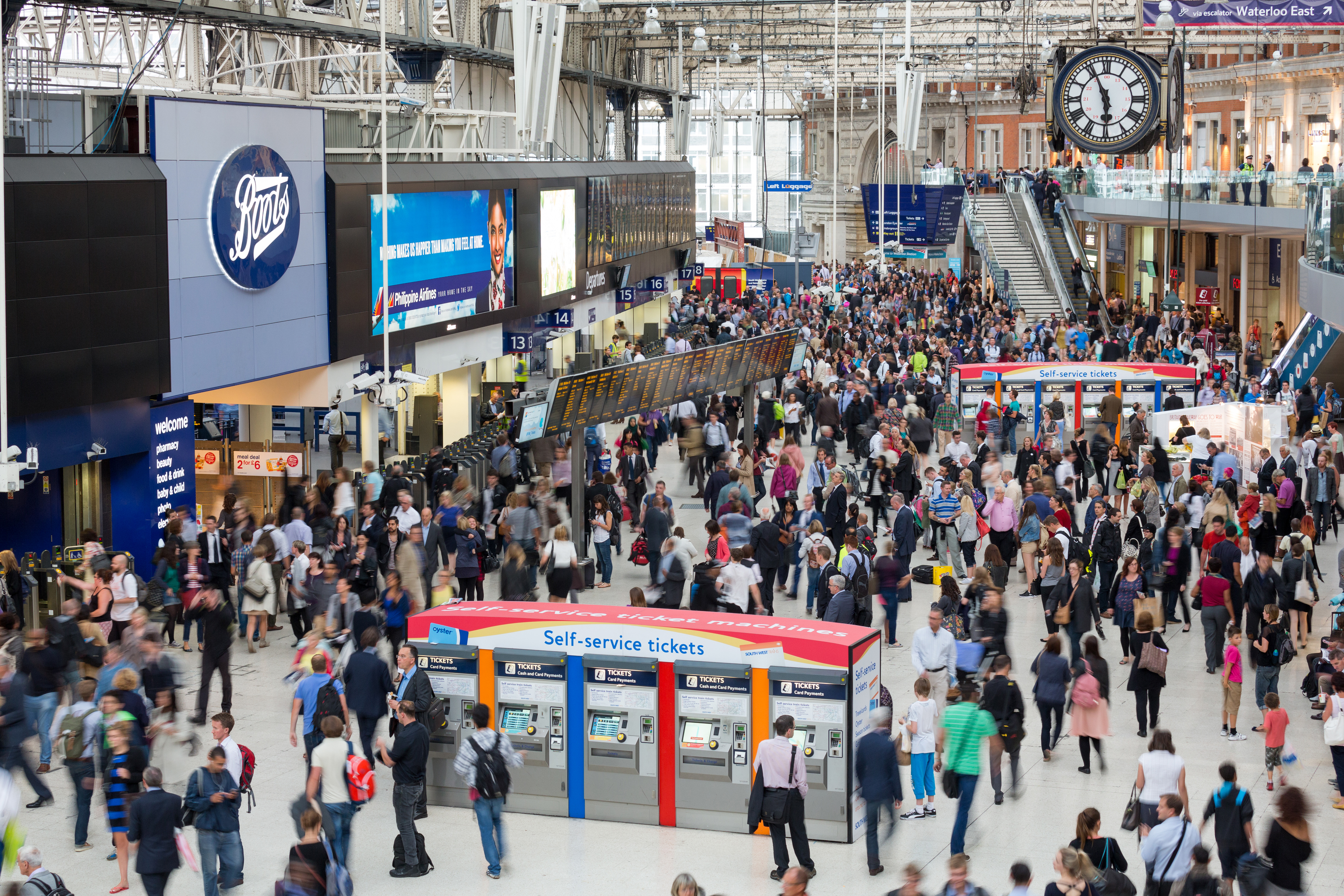
London Waterloo By D. Iliff (Own work) [CC BY-SA 3.0 via Wikimedia Commons
It should be noted at this point that the method of collecting data within London has greatly changed. Before 2016, proportions of travelcards (i.e. where you purchase a ticket to London Zones 1-6 for example) were distributed between all London stations. This process was naturally weighted in favour of large stations and termini. This year the ORR have had access to TfL’s Oyster data meaning more accurate entry and exit figures have been obtained for people using travelcards – resulting in a redistribution of passenger figures away from Zone 12. This explains the somewhat meteoric rise of Stratford and Clapham Junction. It also helps explain why most London termini look as though they have lost some considerable footfall and why Charing Cross has seemingly disappeared from the list all together (now only 14th busiest – down 9).
2I am of course grossly over-simplifying but this saves you reading the extensive supplementary methodology report which can be found here should you want to drill down further into how the data is collected.
Birmingham New Street, largely unadulterated from the methodology change, sees a gain of nearly 4 million passengers after it’s grand re-opening.
Least Used
| Station | Region | Passengers | |
|---|---|---|---|
| 1 (=0) | Shippea Hill | East | 12 |
| 2 (+2) | Reddish South | North West | 38 |
| 3 (+3) | Pilning | South West | 46 |
| 4 (-2) | Coombe | South West | 48 |
| 5 (=0) | Barry Links | Scotland | 68 |
| 6 (+7) | Denton | North West | 74 |
| 7 (+8) | Stanlow & Thornton | North West | 88 |
| 8 (-5) | Tees-Side Airport | North East | 98 |
| 9 (+10) | Chapelton | South West | 100 |
| 10 (+4) | Clifton | North West | 116 |
My favourite part of the Usage Report – the least used stations!
Once again, if 9/10 of the busiest stations in the UK are in London it’s logical that 10 of the least used stations aren’t3. Spread out across the country (though still none in Wales) the top 10 quietest stations range from Coombe in rural Cornwall to Barry Links in remotest Scotland. There’s a bit more movement in the Least Used top 10 as the margins that separate total passenger numbers are obviously much smaller.
Shippea Hill is still the runaway winner, only managing to muster 1 passenger a month on average. The list also includes old favourites such as Reddish South, Pilning and the totally useless Tees-Side Airport.
Denton returns to the top 10 after being dislodged by Elton & Orston in 2015, which itself drops down to Rank No. 21 after seemingly picking up an extra 200 odd passengers from somewhere.
New entries include Stanlow & Thornton and Clifton which is accredited with losing footfall due to the nearby Farnworth electrification project (though it never had a particularly high footfall anyway…).
3London doesn’t make the list until Rank No. 419 where the capital’s least used station, Angel Road, has a comparatively massive 27,754 yearly journeys. This is interestingly 7,000 more journeys than London’s least used station in 2015 (Sudbury & Harrow Road).

Denton – By Rept0n1x (Own work) or CC BY-SA 3.0, via Wikimedia Commons
The reasons for such poor passenger footfall vary. The remote locations of some of the Scottish and Cornish entries naturally produce a low yield in usage despite some of these stations having a reasonable level of service. Others in more densely populated areas such as Denton deliberately have such poor levels of service that passengers are actively discouraged to use them. Infrequent and inconvenient services are ran – often only once a week, in one direction and very early in the morning. These bare minimum ‘Parliamentary Services‘ allow Train Operating Companies to wilfully neglect stations on non-main line routes without legally having to close the station – an expensive and lengthy procedure.
This creates a rather sadly self fulfilling prophecy. Poor passenger numbers don’t attract investment and services. Poor services don’t attract passengers… and so on… Most of the figures for the stations on this list are somewhat false as these erratic services attract rail enthusiasts that wouldn’t otherwise frequent the station in normal circumstances. It’s quite possible that without this unusual form of tourism most of the stations on the above list would have no yearly passengers at all.
Biggest Increase (Raw)
![Canada Water - By ChrisO at English Wikipedia [CC BY-SA 2.5], from Wikimedia Commons](https://upload.wikimedia.org/wikipedia/commons/0/0e/Canada_water_ell.jpg)
Canada Water – By ChrisO at English Wikipedia [CC BY-SA 2.5], from Wikimedia Commons
| Station | Region | Change | |
|---|---|---|---|
| 1 | Canada Water | London | 13,313,178 |
| 2 | Stratford | London | 10,139,056 |
| 3 | Highbury & Islington | London | 8,190,918 |
| 4 | Whitechapel | London | 6,833,834 |
| 5 | Clapham Junction | London | 5,816,380 |
| 6 | Farringdon | London | 5,177,970 |
| 7 | London Bridge | London | 4,333,084 |
| 8 | Shepherd’s Bush | London | 4,219,958 |
| 9 | Birmingham New Street | West Midlands | 3,764,230 |
| 10 | Barking | London | 3,753,596 |
Before we start getting excited about the above table we really need to focus on how the aforementioned change in London data collection is skewing the result. The above table certainly verifies that stations outside of London’s Zone 1 have seen vastly positive increases due to the methodology change. (Later we will see what this has in turn done to the stats for some of the termini).
It’s therefore difficult for us to draw any meaningful conclusions from the above table as the means of data collection was not the same.
![Birmingham New Street - By Bs0u10e01 (Own work) [CC BY-SA 4.0], via Wikimedia Commons](https://upload.wikimedia.org/wikipedia/commons/8/89/2015-09-26_Birmingham_New_Street.jpg)
Birmingham New Street – By Bs0u10e01 (Own work) [CC BY-SA 4.0], via Wikimedia Commons
Thankfully the ORR have included a new column of data to help us compare 2015 and 2016 in a like-for-like fashion using the older estimated travelcard methodology.
“In the production of the 2015/16 statistics, an update has been made using Oyster Clicks Model data to improve the allocation of demand relating to London Travelcards. As this results in some large changes in the estimated usage at stations in and around London, special caution should be exercised when examining the changes between 2014/15 and 2015/16. Additional fields showing the estimated absolute change in usage/interchanges due to the change in London Travelcard methodology are included in the statistics.”
| Station | Region | Change | |
|---|---|---|---|
| 1 | London Bridge | London | 6,603,060 |
| 2 | Farringdon | London | 6,269,203 |
| 3 | London Liverpool Street | London | 6,204,561 |
| 4 | Kensington Olympia | London | 5,593,671 |
| 5 | London Waterloo | London | 4,919,681 |
| 6 | London St. Pancras | London | 3,839,207 |
| 7 | Birmingham New Street | West Midlands | 3,764,463 |
| 8 | Canada Water | London | 3,471,413 |
| 9 | Stratford | London | 2,929,316 |
| 10 | Highbury & Islington | London | 2,671,162 |
The above table shows the increase in passenger numbers using the old methodology of data collection where estimated travelcard destinations are proportionately divided between London stations (favouring larger termini). Because we already know the above figures are not as accurate as they could be, the above table also needs to be treated with caution. We can therefore discredit stations like Waterloo and St. Pancras as we now know that part of this increase is likely being used elsewhere on the network. It does however allow us to see a like-for-like comparison of stations like Canada Water, Stratford and Highbury & Islington which continue to be key hub interchanges between The London Overground and The Tube.
Biggest Decrease (Raw)
| Station | Region | Change | |
|---|---|---|---|
| 1 | London Charing Cross | London | -13,980,738 |
| 2 | London Blackfriars | London | -4,681,378 |
| 3 | London Victoria | London | -4,186,578 |
| 4 | Putney | London | -2,129,756 |
| 5 | Queen’s Park | London | -1,807,958 |
| 6 | London Euston | London | -1,274,428 |
| 7 | Acton Central | London | -1,049,500 |
| 8 | Kilburn High Road | London | -973,128 |
| 9 | Orpington | London | -970,122 |
| 10 | Gospel Oak | London | -939,696 |
Once again the change in methodology is skewing the results this time against London termini. We shall see how the top 3 perform in a like-for-like comparison shortly.
Though this list also is heavily populated by non-Zone 1 stations – note that they are mostly all interchanges. It could be concluded that the old methodology was being over-generous in it’s proportional distribution of travelcard usage at hub stations. It is likely that it was assumed that people were connecting with the tube or other modes of transport at these locations when in fact they were not.
![Charing Cross By mattbuck (category) (Own work by mattbuck.) [CC BY-SA 2.0 or CC BY-SA 3.0], via Wikimedia Commons](https://upload.wikimedia.org/wikipedia/commons/2/2b/Charing_Cross_station_MMB_15_375808_465043_465008.jpg)
Charing Cross By mattbuck (category) (Own work by mattbuck.) [CC BY-SA 2.0 or CC BY-SA 3.0], via Wikimedia Commons
| Station | Region | Change | |
|---|---|---|---|
| 1 | London Charing Cross | London | -8,300,728 |
| 2 | London Victoria | London | -2,467,184 |
| 3 | London Moorgate | London | -852,433 |
| 4 | London Blackfriars | London | -659,736 |
| 5 | Bolton | North West | -652,400 |
| 6 | Glasgow Queen Street | Scotland | -535,166 |
| 7 | Rayleigh | East | -333,042 |
| 8 | Vauxhall | London | -296,954 |
| 9 | Reigate | South East | -294,044 |
| 10 | Greenwich | London | -291,702 |
No matter what method of data collection is used it can be seen that Charing Cross and Victoria have lost quite a lot of passengers. We can likely attribute the loss of custom at Charing Cross to a reversal of form, as, diverted London Bridge services in 2014/2015 are now returning to their rightful location.
London Victoria, Vauxhall and Reigate are possibly suffering from the ongoing Southern Rail crisis whilst Bolton has been plighted by engineering works following works at the nearby Farnworth tunnel. Glasgow Queen Street has also seen diversions due to works.
Overall Changes
It’s important to note that of the 2557 stations only 2714 saw a drop in passenger numbers of over 10,000, most of which were caused by temporary closures, engineering works or strikes.
4Using old methodology for fair comparision.
Percentage Increase
Whilst Raw increases show important information about demand, the data returned can sometimes be misleading regardless of methodology. The increase of nearly 4 million at Birmingham New Street could be considered small fry when the station was already servicing 35 million journeys. This only represents an increase of 10% on the year before. Under this method a small station which say doubles it’s usage would go unnoticed. It’s therefore prudent to also examine percentage increases by dividing the change in passenger numbers by last years totals.
5This list exclude the 14 stations built in 2016 as this would have otherwise returned an infinite result.
| Station | Region | Percentage Increase | Representing Passenger Increase | |
|---|---|---|---|---|
| 1 | Abererch5 | Wales | 508.59% | 1,658 |
| 2 | Bicester Village | South East | 367.47% | 324,992 |
| 3 | Pye Corner | Wales | 320.75% | 48,280 |
| 4 | Elton & Orston | East Midlands | 236.36% | 208 |
| 5 | Tees-Side Airport | North East | 206.25% | 66 |
| 6 | Hensall | Yorkshire | 198.9% | 362 |
| 7 | Lelant | South West | 181.98% | 5,230 |
| 8 | Old Street | London | 137.81% | 2,318,212 |
| 9 | Pegswood | North East | 131.06% | 1,460 |
| 10 | Rauceby | East Midlands | 130.74% | 3,164 |
All the stations in the top 10 have managed to at least double their passenger usage in 2015. Now we’re sorting by percentage increase the capital no longer dominates the top 10. Incidentally we’re using the old like-for-like methodology here as it actually makes very little difference to the table other than moving Old Street down to Rank 11 in favour of Canada Water.
Old Street’s increase is much more significant than Canada Water’s as it has increased it’s footfall by around 2 million regardless of methodology.
![Abererch - By mattbuck (category) (Photo by mattbuck.) [CC BY-SA 2.0 or CC BY-SA 3.0], via Wikimedia Commons](https://upload.wikimedia.org/wikipedia/commons/0/02/Abererch_railway_station_MMB_02.jpg)
Abererch – By mattbuck (category) (Photo by mattbuck.) [CC BY-SA 2.0 or CC BY-SA 3.0], via Wikimedia Commons
Like London, Lelant had a similar methodological change in it’s travelcard distributions in the local area.
The stations with exceptionally poor usage that we saw earlier do not have to do much to skew the rankings. In this manner of data collection Tees-Side Airport, Britain’s 8th least used station, can also boast that it is the 5th most improved despite only gaining 66 passengers. Incidentally last year it was the 2nd most improved and 3rd least used. It may be asked why a station with only 32 yearly journeys suddenly gains a 200% increase in passengers, but this is likely due to it’s status in the least used list.
Bicester Village and Pye Corner show encouraging increases having recently received brand new services or line upgrades. This shows that investment in rail infrastructure in rural areas is getting results.
Percentage Decrease
| Station | Region | Percentage Decrease | Representing Passenger Decrease | |
|---|---|---|---|---|
| 1 | Prestwick International Airport | Scotland | -68.35% | -200,862 |
| 2 | Farnworth | North West | -67.91% | -27,860 |
| 3 | Kearsley | North West | -62.85% | -26,240 |
| 4 | Ebbw Vale Parkway | Wales | -59.97% | -152,270 |
| 5 | Hopton Heath | West Midlands | -55.77% | -2,212 |
| 6 | Moses Gate | North West | -54.47% | -12,388 |
| 7 | IBM | Scotland | -53.53% | -25,360 |
| 8 | British Steel Redcar | North East | -52.87% | -830 |
| 9 | Portsmouth Arms | South West | -49.93% | -754 |
| 10 | Chapelton | South West | -47.92% | -92 |
At the other end of the table we again see a number of low use stations dominate the rankings. Chapelton, a station that from time to time appears in the least used list, is a good example of how a station can halve it’s footfall without dropping that many passengers in the grand scheme of things.
Farnworth, Kearsley and Moses Gate are again casualties of the nearby tunnel works suspending services in the area.
Prestwick Airport tops the list through a mix of methodology change and falling usage of Glasgow Prestwick Airport.
![Prestwick Airport - By Thomas Nugent [CC BY-SA 2.0], via Wikimedia Commons](https://upload.wikimedia.org/wikipedia/commons/5/5a/Prestwick_Airport_railway_station_at_night.jpg)
Prestwick Airport – By Thomas Nugent [CC BY-SA 2.0], via Wikimedia Commons
The decline of IBM and British Steel Redcar are almost definitely symbolic of the industrial areas which they serve.
It’s also worth pointing out that all the stations with the largest decrease of actual passengers have now vanished from this list. Despite London Victoria dropping 2 million passengers this only represents a 2.89% drop (Rank No. 515) in usage for the London terminus. This highlights the importance of examining both increases/decreases in terms of passenger numbers and as relative percentages.
Notes
Now that the London data collection methodology has changed, 2017 will be an even more important year for ORR stats as we will be able to examine change with even greater accuracy.
Finally, despite method changes and an apparent loss of passengers at key London termini, journeys on the UK rail network continue to grow.
Other Statistics
| Total UK Journeys 15/166 | 1,463,777,211 |
| Total Extra Journeys Compared To 14/156 |
71,241,901 |
| Total Extra Journeys As Percentage Increase6 |
5.12% |
| Station With Lowest Raw Change | Thorpe Culvert (2 extra journeys) |
| Station With Most Estimated Interchanges (New Methodology) |
Clapham Junction (30,449,390) |
| Most Popular Season Ticket Destination | London Waterloo (24,041,485) |
| Least Popular Season Ticket Destination7 | Buckenham (1) |
6References entries into the system only.
7A further 119 stations have no season ticket usage at all.
To read the full ORR stats report click here.
8Data was not collected for Heathrow Terminal 2&3, Heathrow Terminal 4, Heathrow Terminal 5 and Manchester United Football Club.

Just proves the old saying that figures can be used to show anything you want! (Depending on how you massage them)