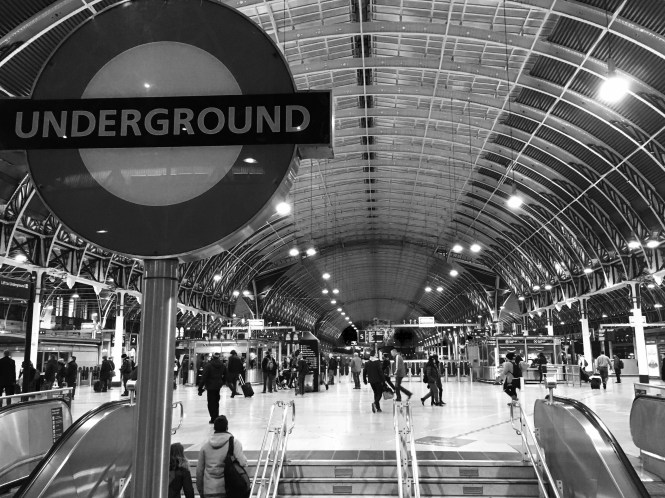
It’s 07:30 on Saturday morning and I’m getting out of the city for the weekend. I’m at Paddington which didn’t disappoint for photo opportunities as I instantly found the shot I wanted: The roundel with the impressive Brunel roof of the mainline station in the background.
However, take a look closer… yes, go on, closer still… Something is wrong. Very wrong.
It wouldn’t be the first time incorrect fonts have appeared on the Underground, and at first glance you might struggle to notice the difference. Even I might have passed this by had I not been encouraged to take a closer look at an image taken by Tim Dunn of the same sign, coincidentally later that same day.
After further investigation, I think the font on the roundel is called Calibri, though some have suggested it could also be Verdana. (See if you can spot it, it’s all in the E. Type it out in word if you don’t believe me!). Quite why Calibri has been used instead of the ubiquitous New Johnston I have no idea. It’s possible TfL isn’t actually responsible for this stairwell and it’s signage and perhaps it’s instead managed by Network Rail. Someone will probably be able to tell me if this theory has any legs because it’s equally plausible that someone at TfL has cocked up – Calibri just happens to be the default font in Microsoft Word at the moment… Just Saying…
Either way, it’s given me an easy name for the blog post – so it’s all panned out great in my eyes…
Image copyright A Carter – CallingAllStations.co.uk
